
Our Client
Mother Mercy is both a space and a movement invested in reimagining the purpose, pillars, and processes of our creativity, and laying out new directions for its expansion.
“This process with Jane has been a grounding joy for my work with Mother Mercy. She rooted and then gave life to layers of vast concepts I shared for a new website, and art that could stand-alone. Jane’s ability to draw out my ideas and distill a shared vision helped this project feel like a real collaboration. The experience has been amplified by the artwork itself...polished, thoughtful and fly.”
What We Did
We worked with Mother Mercy’s founder J. M. Ellis to establish a design system for the Mother Mercy brand.
Design System
Logo
Art
Animation
Website
Blog
Mood Board
Collaborative Mood Boarding
To create alignment between Color Plus Form and Mother Mercy, we kicked off the creative process by:
Clarifying Mother Mercy’s vision, work, history, and approach
Creating a mood board to visually explore inspiration themes, which included Art in the Age of Black Power, Afro Futurism, and Surrealism
Compiling potential interactive concepts and style treatments

Mood Board Inspiration:
- Carolyn Lawrence, Black Children Keep Your Spirits Free (first row, left)
- Wadsworth A. Jarrell (first row, center)
- Barbara Jones-Hogu (first row, right)
- Lorna Simpson (second row)
- Kara Walker (third row, left)
- Mati Klarwein (third row, center)
- Mati Klarwein (third row, right)
- Mati Klarwein (last row, left)
- Lovie Olivia (last row, center)
- Lovie Olivia (last row, right)
Logo Design
Design Concepts
To bring clarity and direction to the logo design process, Color Plus Form created a Mother Mercy logo brief. This document included a short outline of the themes central to Mother Mercy’s work and identity. We used these themes, a list of descriptors, and references to two sculptures for inspiration.
Descriptors:
Purposeful
Mutable
Intellectual
Spiritual
Soulful
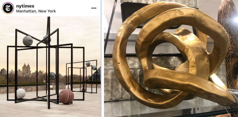
J.M.E. sent these two photos of sculptures for inspiration for the logo. Left: ParaPivot by Alicja Kwade.
We delivered two initial logo concepts that featured a custom designed hieroglyphic inspired font.
The first initial logo concept featured abstract geometric compositions that were inspired by how dandelion flowers transform into white globular seed heads. Another design direction utilized solely the logo text, which allowed for flexibility in its applications.
“Each seed has a tiny parachute that allows it to spread far and wide in the wind. The entire plant has medicinal properties. Dandelions are often mistakenly identified as weeds, aggressively removed, but are hard to uproot; the top is pulled but the long taproot remains. Resilience. Resistance. Regeneration. Decentralization.” (from Adrienne Maree Brown’s Emergent Strategy pg. 46)
Simplicity allowed for more flexibility in the logo application including the blue abstract painting featured as the background here.
With J.M.E. leaning towards the simpler logo version, I refined the concept by mirroring the background image and animating a figure eight movement:
Art Direction
Iterating on Design Concepts
To create the design library that would visually represent Mother Mercy, we pulled references and inspiration from the book Emergent Strategy by Adrienne Maree Brown. Some of the visual concepts inspired from the text include:
elements of nature to represent agitation, which we invoked as a symbol of sparking transformative change
simple pattern repetition to symbolize emergence (“emergence is the way complex systems and patterns arise out of a multiplicity of relatively simple interactions”)
portraits in a digital collage to center the “birthwork” framework for approaching creativity
The background patterns for all the Mother Mercy artwork were created by cropping the same photo over and over in shapes that resembled the gills under a mushroom cap.
Inspiration for the use of mushrooms came from Adrienne Maree Brown’s reference to mycelium in Emergent Strategy and is used here to signify interconnectedness, remediation and detoxification. This “mushroom” template was applied to photographs of nature landscapes that symbolized agitation: eruption, erosion, gravitational pull, etc.
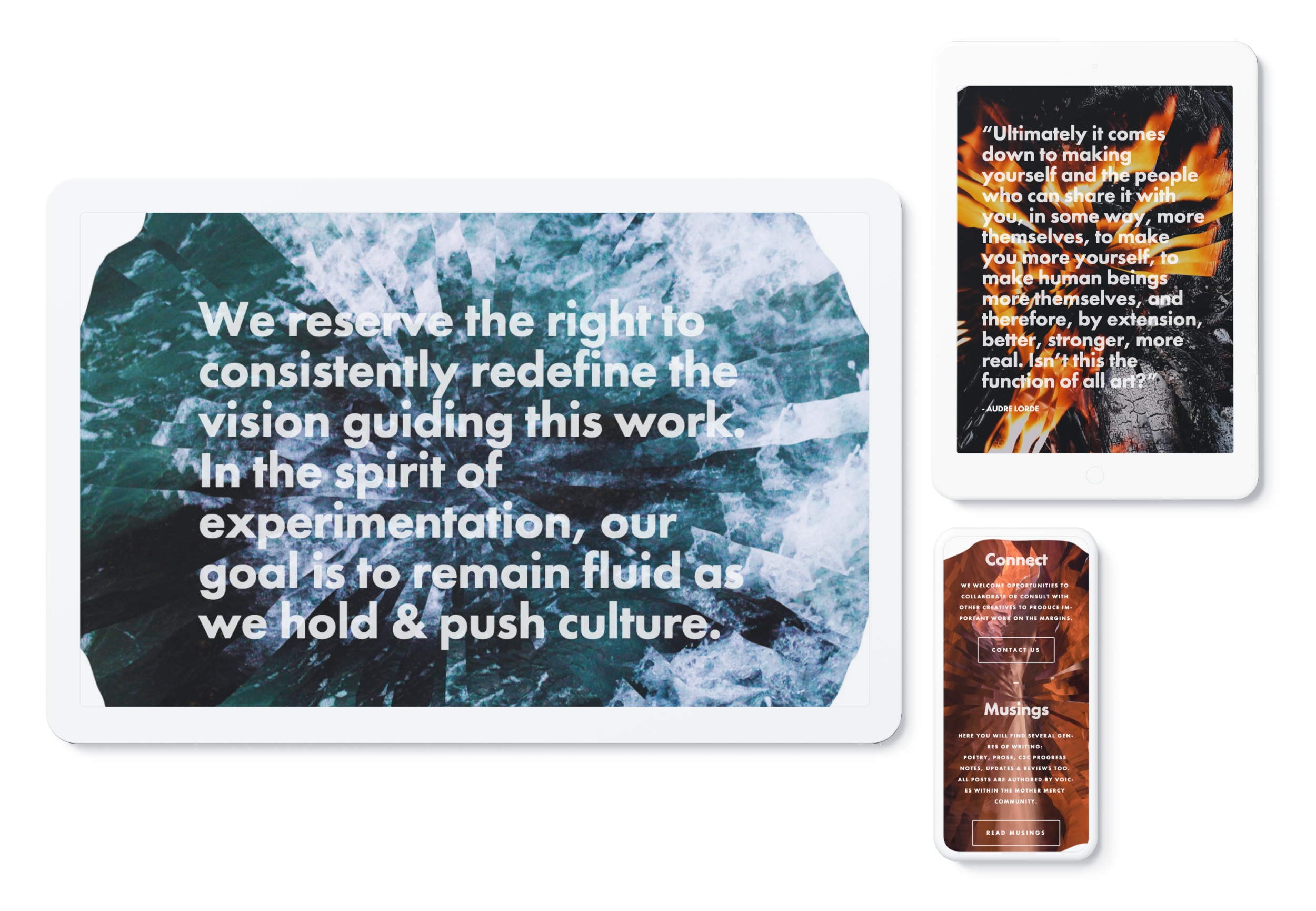
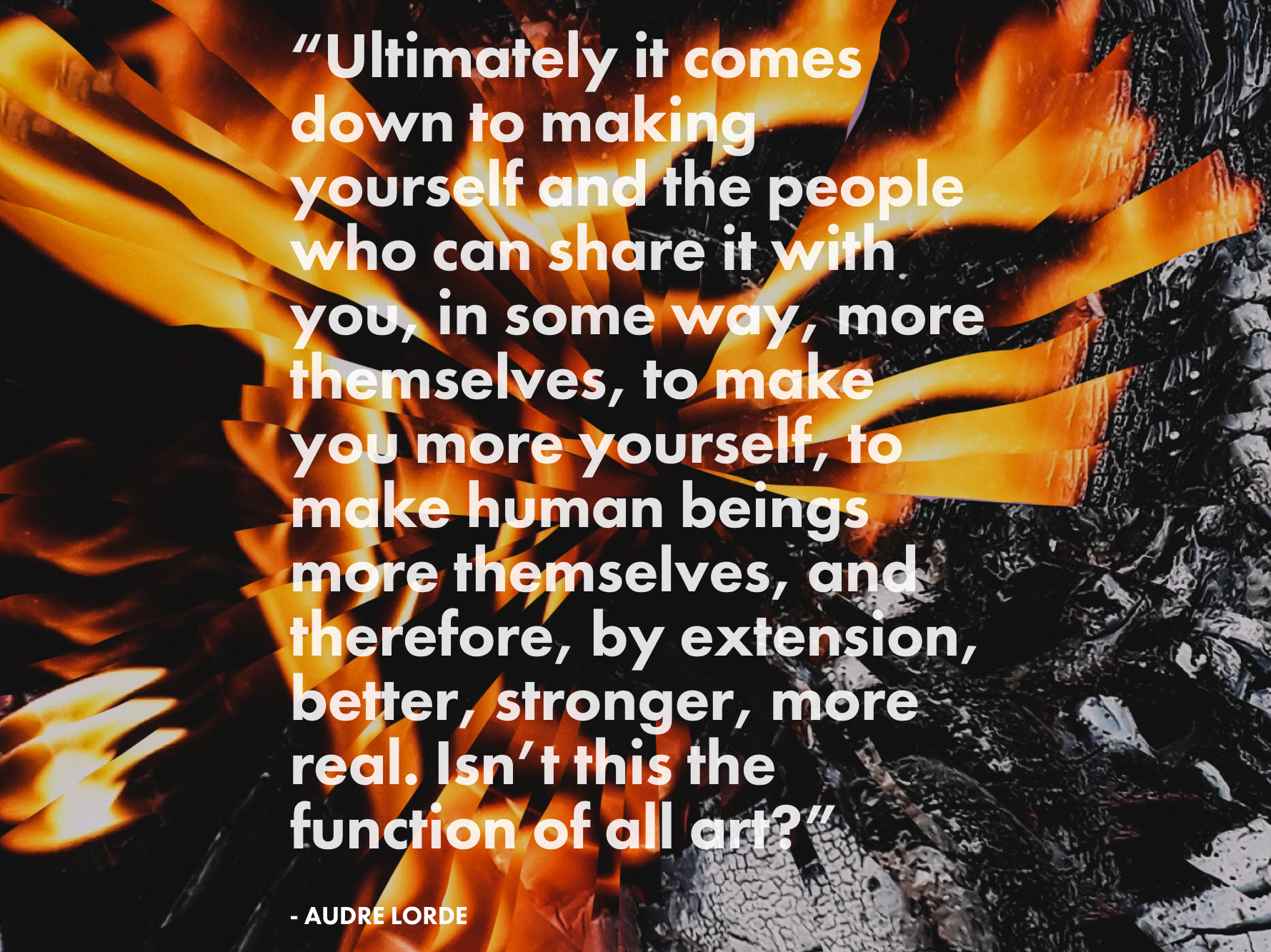
We included additional compositions utilizing the “mushroom” pattern to complete the design library. The artworks were utilized as backgrounds to anchor text, quotes, and call to actions on the website.
Phase 3
Launching the Landing Page
Once the art direction was settled and the website copy was written, we began rapidly prototyping the homepage in SquareSpace.
This video shows the site as it was initially launched Juneteenth 2019. To view the latest version of the Mother Mercy website, please visit mothermercy.org